Squarespace 7.1 is renowned for its prowess in enabling the creation of visually stunning and responsive websites. However, there might be occasions when you wish to fashion a custom layout for mobile in Squarespace deviating from the desktop arrangement. This can be particularly beneficial in delivering an optimized experience to your mobile audience. In this blog post, we’ll guide you through the process of creating a custom layout for mobile in Squarespace 7.1.
How to Create Custom Layout for Mobile in Squarespace 7.1
- Log in to your Squarespace Account.
Navigate to Website>Website Tools>Custom CSS.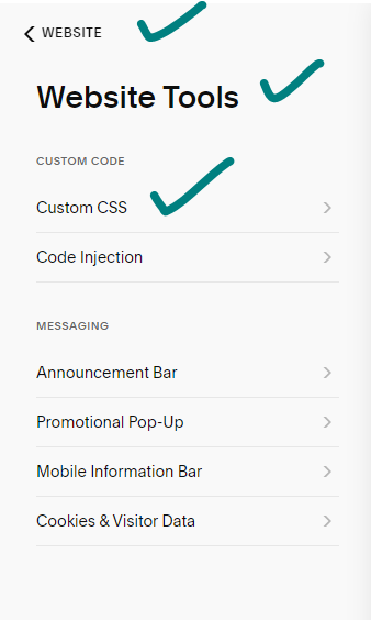
- To initiate your custom mobile layout, insert the following code into your Code Injection settings:
<p class="">@media only screen and(min-width:641px) {[mobile-data-section-id]{display:none}}<p class="">@media only screen and (max-width:640px) {[desktop-data-section-id]{display:none}}
- Class Customization: Replace the data section ID with the ID corresponding to your desktop and mobile sections.
- Save and Publish: Save your modifications and publish your website to make the changes live.
Built-in options for Mobile Layout Customization
Squarespace 7.1 offers an array of built-in options to enhance your mobile layout:
- Mobile Layout Settings: Choose from pre-built layouts or fashion your own custom layout.
- Mobile Visibility: Opt to display or conceal specific sections on mobile devices.
- Mobile Padding and Margins: Adjust the padding and margins of your sections exclusively on mobile.
- Mobile Fonts and Colors: Select distinct fonts and colors dedicated to your mobile layout.
By combining the code injection method with Squarespace 7.1’s built-in features, you can curate a custom mobile layout that seamlessly amalgamates beauty and functionality.
Additional Tips for Mobile Layout Creation in Squarespace 7.1
- Simplicity is Key: Keep your mobile layout simple and easy to navigate for an optimal user experience.
- Prioritize Readability: Opt for large, easy-to-read fonts that enhance readability on smaller screens.
- Image Optimization: Ensure your images are optimized for mobile devices to facilitate faster loading.
- Thorough Testing: Test your mobile layout across diverse devices to ensure it not only looks good but functions seamlessly.
Additionally, while Squarespace 7.1 provides built-in options, there exist third-party plugins that extend further customization possibilities. It’s crucial to opt for reputable and well-supported plugins to enhance your Squarespace experience.
Conclusion:
In conclusion, with a bit of effort, you can design a mobile layout that seamlessly combines aesthetics and functionality, providing your visitors with an exceptional browsing experience.We trust this guide has equipped you with the knowledge to fashion a bespoke mobile layout in Squarespace 7.1. For any queries, feel free to drop a comment below.
How to customize Squarespace forms with CSS | Custom Contact form
How to Embed Google Forms in Squarespace
