In today’s world dominated by smartphones, making sure your website looks fantastic on small screens is not just a choice; it’s a must. Squarespace 7.1 gives you the tools to create great desktop layouts, but what about mobile? Don’t worry, Squarespace enthusiasts, this blog is here to guide you into the world of crafting two columns of content in Squarespace Mobile Version!
Is your Squarespace site feeling a bit lost on those tiny phone screens? Fear not, fellow digital creators! Today, let’s explore the magic of creating custom two-column layouts for mobile in Squarespace 7.1. By the end of this journey, you’ll be ready to transform your site from a single-file snooze-fest to a lively, mobile-optimized masterpiece.
Just a heads-up: This guide is designed for Squarespace 7.1. Older versions won’t be able to join in on the two-column fun.
The Power of Two Columns on Mobile
Mastering the art of two-column layouts on mobile devices in Squarespace 7.1 isn’t just about making things look good; it’s about giving your users a better experience. By neatly arranging content into two columns, you’re optimizing space and readability, ensuring visitors can easily engage with what your site offers.
Creating two columns of content in Squarespace Mobile Version
Now, grab your coding wand, and let’s create some mobile magic!
- Log in to your Squarespace account and choose the site you wanna edit.
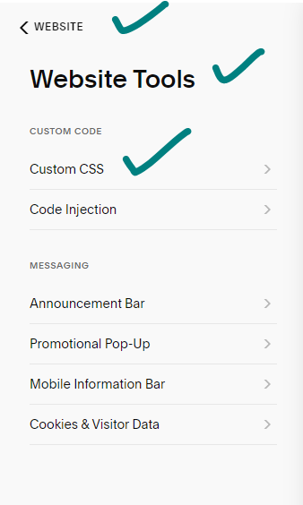
- Navigate to Website>Website Tools>Custom CSS.

- Copy the desired code from below and paste it under Custom CSS.
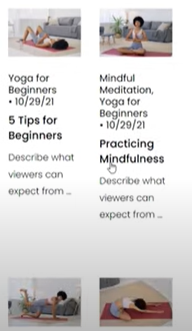
Video Collection Pages:
Showcase your cinematic gems in pairs! This bit of code works its magic on those fancy video collection pages:
@media only screen and (max-width: 788px) {
.lessons .list-grid {
display: grid;
grid-template-columns: repeat(2, minmax(0, 1fr))!important
}
}
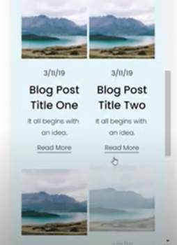
Grid Blog Layout:
It’s time to up your blog’s mobile game! This code handles the grid blog layout:
@media only screen and (max-width: 767px) {.blog-basic-grid {
display: grid;
grid-template-columns: repeat(2,minmax(0,1fr))!important;
grid-column-gap: 5px!important;
grid-row-gap: 5px!important;
grid-auto-rows: min-content!important;
}}
Products:
Turn your mobile store into a shopping spree haven with this code:
@media only screen and (max-width: 767px) {
.products .list-grid {
display: flex;
flex-wrap: wrap;
justify-content: space-between;
}
.products .grid-item {
width: 48%;
}
}
List Sections:
Don’t let your lists get lonely! This code jazzes up simple list sections with two-column goodness:
@media only screen and (max-width: 640px){
.user-items-list-simple:not([data-num-columns="1"]) {
grid-template-columns: repeat(2,1fr);
grid-gap: 10px!important}
.list-item-content__title{font-size: 1rem!important}
.list-item{padding: .5rem!important}
}
Bonus Tip: Remember, it’s not just about code! Explore Squarespace’s built-in mobile settings like padding and margins for even more fine-tuning.
Ready to unleash your mastery of mobile layouts? Don’t be afraid to experiment! Start small, test across different devices, and watch your site transform into a mobile masterpiece. Remember, having a mobile-friendly site isn’t just a trend; it’s a necessity. So, grab your code (and maybe a cup of coffee), roll up your sleeves, and conquer the mobile web!
How to customize Squarespace blog title font
How to enable your SSL in Squarespace
P.S. Feeling a bit lost? The Squarespace community and the web are full of resources. Use the Help Center, Forums, and third-party tutorials to turn your mobile layout dreams into reality.