Striking the right balance between a clean design and easy navigation is a common challenge for website creators, especially in Squarespace 7.1. When aiming for a minimalist look, the desktop navigation bar can sometimes clash with aesthetics. Here’s a clever solution: consider using the mobile menu on desktop in Squarespace.
This might sound unconventional, but bear with me. Placing a discreet hamburger menu strategically can give your site a sleek and uncluttered design while still providing convenient access to all your pages. It works wonders for portfolios, creative agencies, or anyone who values visual impact.
Why go for a mobile menu on a desktop?
- Clean Aesthetics: Say goodbye to the horizontal navigation bar and let your main content stand out. This is especially effective for sites heavy on images, where a minimalist layout enhances the visuals.
- Modern Touch: Hamburger menus are common on mobile devices, and extending them to desktops creates a seamless user experience across different devices.
- Space Optimization: If your site has numerous navigation links, a desktop mobile menu reduces clutter, keeping users focused on what matters.
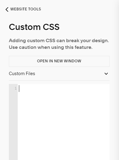
Custom CSS: Mobile Menu on Desktop in Squarespace 7.1
Access the CSS Editor:
-
- Log in to your Squarespace site.
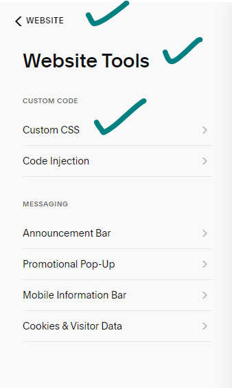
- Go to Website > Website Tools > Custom CSS.

Choose Your Menu Style:
-
- For a full-screen mobile menu or a half-screen menu with a shadow, paste the corresponding code provided.
 For full screen:
.header .header-burger{display:flex}
.header-nav, .header-actions {display:none}
.header--menu-open .header-menu { opacity: 1; visibility: visible;}
- For a full-screen mobile menu or a half-screen menu with a shadow, paste the corresponding code provided.
- For half screen:
.header .header-burger{display:flex}
.header-nav, .header-actions {display:none}
.header--menu-open .header-menu {
opacity: 1; visibility: visible;
width: 50%;
margin-left: 50%;
box-shadow: -5px 5px 15px #000}
 For full screen:
Customize (Optional):
-
- Adjust width, margin, or shadow properties to tailor the menu’s appearance to your liking.
Save and Test:
-
- Click Save to apply the CSS changes.
- Test thoroughly on various devices and screen sizes to ensure functionality.
Key Points:
- The code uses CSS selectors to target specific header elements for the desired menu behavior.
display: flexmakes the hamburger icon visible on desktop.display: nonehides standard navigation and action buttons.opacityandvisibilityproperties control the mobile menu’s appearance when opened.
Alternatives:
- Third-Party Plugins:
- Explore plugins like “Mobile Menu on Desktop” or “Navigation Tweaks” for a no-code approach.
- Theme Selection:
- Certain Squarespace themes, like Brine or Vint, may have built-in options for displaying the mobile menu on the desktop.
Pro Tips:
- Optimize the Mobile Menu: Ensure it’s user-friendly with a clear hierarchy and easy navigation.
- Call to Action: Since the main navigation steps back, use prominent buttons or CTAs within your content to guide users.
By embracing a mobile menu on a desktop, you can achieve a harmonious blend of aesthetics and functionality for your Squarespace site.
How to use a summary block in Squarespace
Conclusion:
In conclusion, adopting a mobile menu on the desktop in Squarespace 7.1 proves to be a strategic and innovative solution for creators seeking the delicate equilibrium between aesthetics and functionality. By eschewing the traditional desktop navigation bar in favor of a discreet hamburger menu, websites can attain a minimalist and uncluttered design without sacrificing ease of access. Ultimately, the mobile menu on the desktop not only addresses the real struggle faced by website creators but opens up a realm of possibilities for a seamless and visually impactful user experience across devices.