Your website’s mobile menu icon may seem like a tiny detail, but it’s surprisingly important. It’s the first thing mobile users see when they need to navigate your site, and it can make a big impression. If you’re rocking the default hamburger icon in Squarespace 7, you might be craving something a little more unique. Worry not, fellows! In this guide, you’ll learn how to replace mobile menu icon in Squarespace 7, from choosing the perfect image to injecting a little custom CSS.
Benefits of a unique menu icon
- Enhanced Visibility: A distinct and noticeable mobile menu icon ensures that visitors can easily locate and interact with the navigation menu on your Squarespace site, contributing to a positive user experience.
- Brand Consistency: Customizing the mobile menu icon helps maintain a consistent visual identity with your brand, reinforcing brand recognition and creating a cohesive online presence.
- Improved User Recognition: A unique or branded mobile menu icon enhances user recognition, making your site more memorable and encouraging repeat visits.
- Increased Click-through Rates: A customized and attention-grabbing mobile menu icon can lead to higher click-through rates, promoting increased engagement with your site’s navigation and content.
- Enhanced User Experience: Choosing a more intuitive or representative icon contributes to a smoother and more user-friendly experience, reducing confusion and improving overall site navigation.
These benefits collectively contribute to a more user-centric and visually appealing Squarespace website, fostering positive interactions and leaving a lasting impression on your audience.
How to Replace Mobile Menu Icon in Squarespace 7
Step 1: Choose Your New Icon
This is where you get creative! Think about what vibe you want your website to give off. Do you want a sleek and modern icon? A playful and quirky one? The possibilities are endless! Here are some ideas to get you started:
- Your Brand Logo: Showcase your brand identity front and center.
- Custom Icon: Hire a designer to create an icon that’s totally unique to you.
- Free Icon Pack: Find a free icon pack online that matches your style.
- Emoji: Yes, you read that right! Emojis can be surprisingly effective mobile menu icons.
Step 2: Upload Your Icon to Squarespace
Once you’ve chosen your icon, you need to upload it to your Squarespace site. Here’s how:
- Go to your Squarespace dashboard and click on the Settings tab.
- Select Advanced from the menu on the left.
- Click on Manage Custom Files.
- Drag and drop your icon image into the upload area.
- Make a note of the image URL, you’ll need it later.
Step 3: Add Some Custom CSS Magic
Now comes the fun part: using a little bit of code to tell Squarespace where to put your new icon. Don’t worry, it’s not as scary as it sounds! Here’s what you need to do:
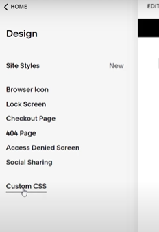
- Go back to the Design tab in your Squarespace dashboard.
Click on Custom CSS.
- Copy and paste the following code into the editor:
.Mobile-bar-menu { stroke: transparent; background-image: url('YOUR_IMAGE_URL_HERE'); background-size: contain; background-repeat: no-repeat; background-position: right; background-color: transparent !important; height: 25px; } .burger-inner { display: none; }- Replace
YOUR_IMAGE_URL_HEREwith the actual URL of your uploaded icon image. - Click Save.
- Replace
WAIT A SECOND! This code is for following Brine Family Templates : Brine, Farro, Hatch, Heights, Hunter, Hyde, Impact, Jaunt, Keene, Lincoln, Maple, Margot, Mercer, Mojave, Motto, Nueva, Pedro, Polaris, Pursuit, Rally, Rover, Royce, Sofia, Sonora, Sonny, Thorne, Vow, Wav, West
Step 4: Preview and Test Your New Icon
Now it’s time to see your handiwork in action!
- Switch your Squarespace preview to Mobile.
- Refresh the page.
- Voila! Your new mobile menu icon should be proudly displayed.
Theme Specific Changes in Codes:
Brine Family (Brine 2020) Templates
- Adirondack, Almar, Anya, Cacao, Clay, Ethan, Fairfield, Forte, Greenwich, Hayden, Hemlock, Henson, Indigo, Juniper, Keene, Kin, Laurel, Leah, Maple, Margot, Marta, Meridian, Mojave, Moksha, Montauk, Newburgh, Nueva, Pedro, Polaris, Quincy, Rally, Rover, Royce, Sofia, Sonora, Sonny, Thorne, Vow, Wav, West:
.Mobile-bar-menu {
  stroke: transparent;
  background-image: url('YOUR_IMAGE_URL_HERE');
  background-size: contain;
  background-repeat: no-repeat;
  background-position: right;
  background-color: transparent !important;
  height: 25px;
}

.Header-nav-bar-wrapper .Mobile-bar-menu-icon-toggle .burger-inner {
  display: none;
}
Pacific Family Templates
- Avenue, Basil, Blend, Canopy, Clay, Coast, Custom Template, Dune, Fairfield, Foster, Greenwich, Hatch, Heights, Hunter, Hyde, Impact, Jaunt, Juke, Keene, Kin, Lincoln, Marco, Margot, Marta, Meridian, Mojave, Moksha, Montauk, Motto, Nueva, Pedro, Polaris, Pursuit, Rally, Rover, Royce, Sofia, Sonora, Sonny, Thorne, Vow, Wav, West:
.Mobile-bar-menu {
  background-image: url('YOUR_IMAGE_URL_HERE');
  background-size: 50px;
  background-repeat: no-repeat;
  background-position: center;
  background-color: transparent !important;
  height: 50px;
  width: 50px;
  border: none;
}

.Mobile-bar-menu .burger-inner {
  display: none;
}
York Family Templates
-
York:
.Mobile-nav-toggle-icon-wrapper {
  background-image: url('YOUR_IMAGE_URL_HERE');
  background-size: contain;
  background-repeat: no-repeat;
  background-position: center;
  height: 30px;
  width: 30px;
}
Important Tip: If you’re unsure of your theme family, you can find it by going to Settings > Help in your Squarespace dashboard. Your theme family will be listed under Site Information
How to Remove Powered by Squarespace
How To Customize Mobile Info Bar Colors
Bonus Tips:
- You can adjust the size of your icon by changing the value in the
heightproperty of the.Mobile-bar-menurule. - Want to add some padding around your icon? Add some space to the
background-positionproperty. - Play around with different icon styles and placements to find what works best for your site.
Congratulations! You’ve successfully replaced your boring old mobile menu icon with something fresh and fabulous. Now go forth and show off your unique website personality to the world!
Wrapping it up!
Remember, your mobile menu icon is like a mini billboard for your site. Make it something that catches the eye and reflects the essence of what you do. So, go wild! Experiment with different icons, styles, and placements to find the perfect fit for your audience.
And hey, if you ever get stuck, don’t hesitate to refer back to this guide or reach out to the Squarespace community for help. The possibilities are endless, so get out there and design a mobile menu icon that truly satisfies your craving for website excellence!
I hope this guide has been helpful! If you have any questions, feel free to leave a comment below.
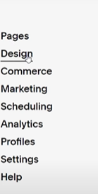 Click on Custom CSS.