
In the fast-paced digital world, where everyone is constantly on the go, having a mobile-friendly website is crucial. One key aspect of ensuring a pleasant user experience on mobile devices is adjusting the font size. In this guide, we will show how to change mobile font size in Squarespace. Adjusting your mobile font size is easier than you think, and it can make a huge difference in the user experience for everyone visiting your site on their smartphones. Give a try to this easy-to-follow guide if you don’t know how to change mobile font size in Squarespace.
Why Change Mobile Font Size?
Think about it this way: a font size perfect for a big desktop monitor might look tiny and unreadable on a phone screen. This can frustrate visitors, hurt your website’s engagement, and even affect your search engine ranking. By tailoring your font size for mobile devices, you ensure your website is readable, enjoyable, and accessible to everyone.
How to change mobile font size in Squarespace
Squarespace lets you adjust your mobile look through a magical tool called Custom CSS. Don’t let the “CSS” part scare you! It’s just some simple code that tells your website how to look on different devices. To access it, follow these steps:
- Log in to your Squarespace account and open the website you want to edit.
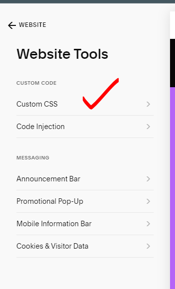
- Click on Website, then scroll down and click on Website Tools>Custom CSS.

- Don’t worry about the code already there; we’ll be adding our own bit to adjust the font size.
Media Queries and Font Size Rules
Here’s the secret sauce: we’ll use “media queries” to tell Squarespace what to do on mobile screens. Then, we’ll specify the new font size using a simple rule. 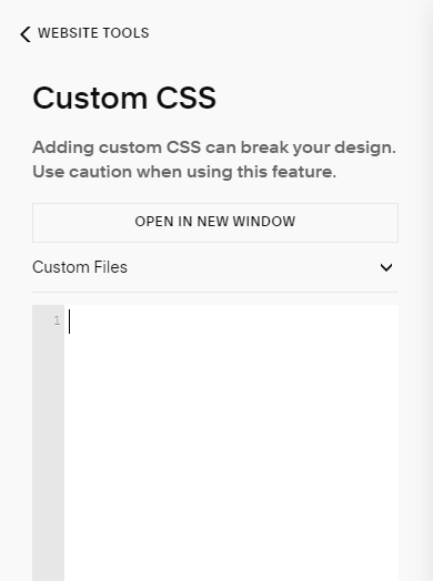
Here’s how it works:
- Media Query:
@media only screen and (max-width: 640px) { /* This tells Squarespace the following code applies only to screens smaller than 640px (typical mobile width) */ }- Font Size Rule:
body {
  font-size: 16px !important;
  /* This changes the font size for all text on your website to 16px. Don't forget the "!important" part; it makes sure your code takes priority. */
}
- Font Size Rule:
Pro Tips for Perfect Mobile Text:
- Experiment with different font sizes: Try 14px, 16px, or even 18px to see what feels best for your website.
- Target specific elements: Instead of changing all text at once, you can target specific elements like headings, paragraphs, or menus using their HTML tags (e.g., h1, p, nav).
- Use relative units: Pixels (px) can look different on different screens. Consider using relative units like REMs (based on your base font size) for better adaptability.
- Preview & Test: After adding your code, always click the “Preview” button to see how it looks on mobile. You can also test your website on your own phone to make sure everything is perfect.
Add A Click To Call Button To Squarespace Mobile Menu
Add Custom Font to Squarespace
Conclusion:
By taking control of your mobile font size, you’re showing your website some love and giving your visitors a much better experience. Remember, a readable and accessible website is a happy website, and happy websites attract more visitors, engagement, and success! So go forth, conquer the mobile world, and make your Squarespace site shine on every screen!
I hope this guide helps you unlock the power of mobile font size adjustments in Squarespace. If you’re still facing any issue you can seek help from Squarespace Help Center.