Tired of your Squarespace site looking the same on all devices? You’re not alone. While a consistent brand image is important, sometimes you want to give your mobile visitors a unique experience. That’s where custom mobile background images come in! ✨ In this guide, we’ll unlock the secrets to adding a different background image on mobile in Squarespace. We’ll cover everything from choosing the right image to using clever CSS tricks, so you can create a truly immersive experience for your on-the-go audience.
Get ready to unleash your mobile design magic!
P.S. Stay tuned for bonus tips on optimizing your mobile images for speed and performance.
Adding different background images on mobile in Squarespace
Ready to dive in? Buckle up as we explore various methods for achieving mobile mastery:
Squarespace is a fantastic platform for building beautiful and functional websites, but one limitation can be having the same background image on both desktop and mobile devices. This can feel restrictive, especially if you want to create a unique mobile experience for your visitors.
Fear not! There are several ways to achieve this, and this blog post will guide you through detailed methods to set a different background image for mobile in Squarespace. We’ll explore various approaches, from simple fixes to custom code solutions.
Method 1: Utilize Squarespace’s Built-in Mobile Version Editor
Squarespace offers a built-in mobile version editor that allows for some basic customization. Here’s how to use it:
- Go to your Squarespace website and open the page you want to edit.
- Click on the “Mobile Version” tab in the top right corner.
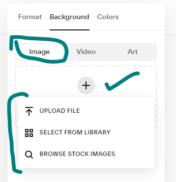
- Select the section you want to modify the background image for.

- Click on the “Background” button in the settings panel.

- Choose “Image” from the options.
- Select the image you want to use for mobile from your Squarespace library or upload a new one.

- Click “Save” to apply your changes.


This method is straightforward and works well for simple changes. However, its limitations:
- You can only set a different background image for the entire section, not for individual elements.
- The mobile image options are limited to what’s available in your Squarespace library or what you upload.
Method 2: Employ Custom CSS for Ultimate Control
For the most precise control over your mobile background image, custom CSS is your best friend. This method requires some coding knowledge, but there are plenty of resources and tutorials available online to help you out. Here’s how:
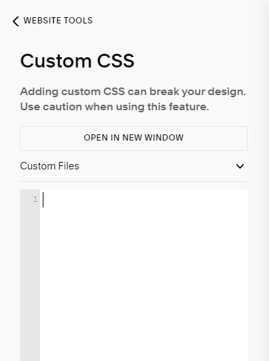
Access the Custom CSS Editor:
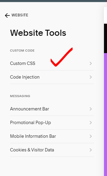
- Go to your Squarespace website’s Home Menu.
- Click on Website>Website Tools.
- Select Custom CSS.
 2. Paste Your CSS Code:
- Copy the CSS code you want to use (like the example provided earlier).
- Paste it into the large text box within the Custom CSS editor.

@media only screen and (max-width: 640px) {
  .section-background img {
    opacity: 0;
  }
  .section-background {
    background-image: url("your-mobile-image.jpg");
  }
}
This code will:
- Hide the desktop background image on mobile devices.
- Set your custom mobile background image for the section.
Remember to replace “your-mobile-image.jpg” with the actual URL of your mobile background image. You can also adjust the CSS code to target specific sections or elements on your page.
Bonus Tip: Consider using media queries to target different screen sizes and ensure your mobile background image looks good on all devices.
And there you have it! By following these steps, you can wield the power of different background images and create a truly captivating Squarespace experience for all your visitors, regardless of their device.
Got any questions or creative mobile background ideas? Share them in the comments below!
You may also love:
How to link social media accounts in Squarespace
How to customize main menu in Squarespace 7.1