First impressions are everything, and in the digital realm, your website’s menu is the gateway to a visitor’s experience. On mobile, where attention spans are shorter, the menu becomes even more crucial. Squarespace 7.1 allows some adjustments, but for true font finesse, we need to delve into the realm of custom CSS. Let’s begin with How to use a custom Font for mobile menu in Squarespace 7.1. Think of it as your typographic lightsaber – a powerful tool to elevate your basic mobile menu font into something truly brilliant!
It’s essential to note that Squarespace 7.1 is the key to unlocking these font customization powers. Unfortunately, older versions lack this capability, so upgrading is a prerequisite.
The Power of Custom CSS
Custom CSS is our secret weapon for a visually appealing mobile menu font. Just like a lightsaber, it gives us the precision and control needed to stand out in the digital universe. The analogy is not just symbolic; it’s a practical approach to transforming the ordinary into the extraordinary.
Using Custom Font for Mobile Menu in Squarespace 7.1
Choosing Your Font Wisely
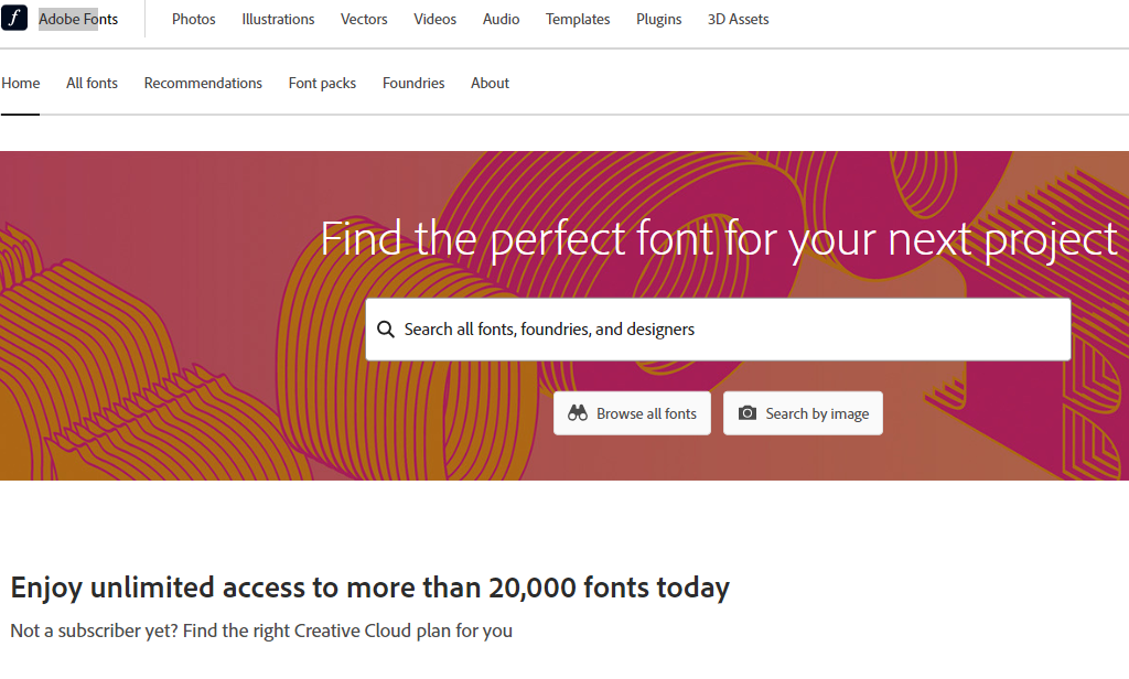
When it comes to selecting a custom font for your mobile menu, there are several factors to consider. First, explore font resources and licensing options. Websites like Google Fonts and Adobe Fonts offer an extensive library of free and licensed fonts that you can use for your website.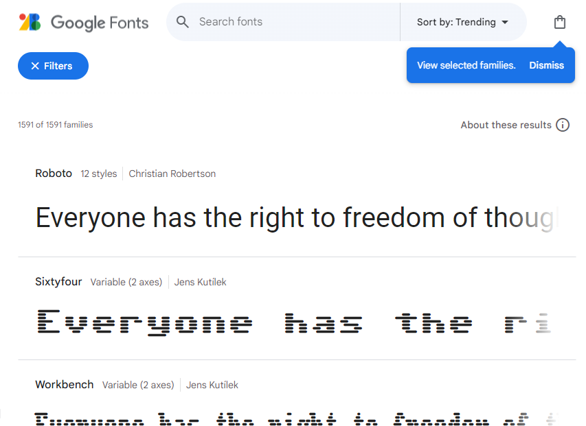
When choosing a font, consider its compatibility with your brand. Does it convey the right tone? Does it reflect your brand’s personality? These considerations will ensure that your mobile menu font aligns seamlessly with the rest of your website.
Uploading Your Font Treasure
- Once you’ve chosen the font, log in to your Squarespace account.
- Navigate to “Website Tools” > “Custom CSS” and then click on “dropdown icon>+ icon.”

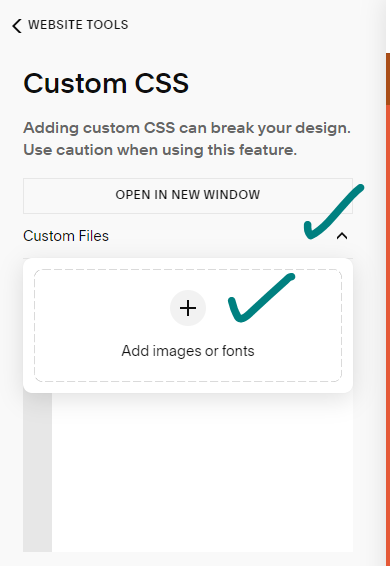
Here, you’ll drag and drop your font file (preferably .ttf or .otf). Squarespace will work its magic, preparing your chosen font for action.
Crafting Your CSS Spell
Copy and paste the following code into the Custom CSS panel, but remember to replace “YourFontName” with your chosen font’s name and update the path if necessary:
@font-face {
  font-family: "YourFontName";
  src: url(path/to/your/font.ttf);
}

.header--menu-open a {
  font-family: "YourFontName", sans-serif;
}
This code applies the font magic to all mobile menu links, including your site title. If you want to be more specific, variations are provided for targeting page links or focusing on the button.
Want to be more specific? Use these variations:
- Target-only page links: Replace
.header--menu-open awith.header--menu-open .header-menu-nav-folder-content a. - Focus on the button: Swap
.header--menu-open awith.header--menu-open .btn.
Saving and Witnessing the Fontastic Transformation
Click “Save” in the Custom CSS panel and preview your mobile menu. Marvel at the glory of your typographic feat! You’ve just bestowed your website with a unique voice that resonates even on the smallest screens.
Bonus Tips
As you revel in your newfound typographic prowess, don’t forget these bonus tips:
- Clear your browser cache for good measure.
- Test your font choices on various mobile devices to ensure optimal readability.
- Use custom fonts sparingly to avoid performance issues. Remember, with great power comes great responsibility; in this context, it also affects website loading speed!
Conclusion
In the realm of websites, every element speaks volumes, and your mobile menu is no exception. By following these steps and unlocking your inner typographer, you’ve transformed your mobile menu from basic to brilliant. Remember, your website’s voice matters, and the mobile menu is the perfect canvas to let it shine through!
You may also like:
How to Assign an Image Animation in Squarespace
How to customize the footer of a lesson in the Squarespace course