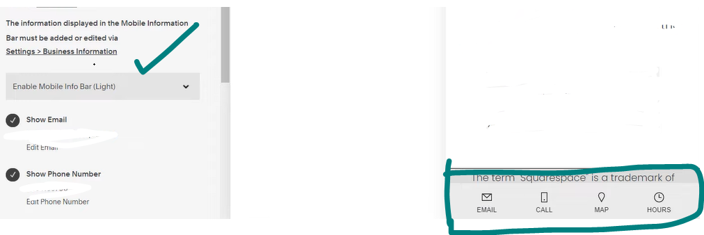
In the ever-evolving landscape of website design, customization has become a crucial aspect of creating a unique and engaging user experience. Squarespace, known for its user-friendly interface, allows you to tailor various elements of your site, including the mobile information bar. This blog post will guide you through the process of customizing the colors of the mobile information bar on Squarespace using simple CSS codes. Let’s begin the process of How To Customize Mobile Info Bar Colors.
Understanding the Basics-How To Customize Mobile Info Bar Colors
Before diving into customization, it’s essential to understand the two key components we’ll be working with:
- The background color of the mobile information bar
- The color of the trigger label.
Light and Dark Options
Squarespace 7.1 offers a thoughtful approach to mobile design by providing users with a choice between light and dark versions of the mobile info bar. The decision between these options can significantly impact the visibility and accessibility of text and icons within the mobile menu.
- Light Option: The light mobile info bar features dark text and icons. This creates a high-contrast environment, making it easier for users to read and interact with the content. Choose the light option when you want your text and icons to stand out prominently against a brighter background.
- Dark Option: Conversely, the dark mobile info bar adopts a design with light text and icons. This is ideal for scenarios where you prefer a subtle and elegant contrast against a darker background. The dark option can contribute to a cohesive and aesthetically pleasing design.
Step-by-Step Customization:
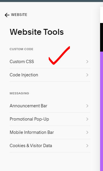
- Log in to your Squarespace account and navigate to the “Website Tools” tab.
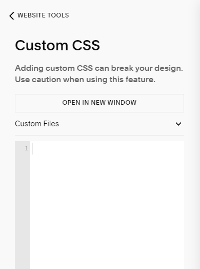
- Click on “Custom CSS” to access the custom code editor.
- Copy and paste the respective codes for background and trigger label color customization.
To change the background color of the mobile information bar, use the following code:
.sqs-mobile-info-bar {
    background: red!important;
}
If you wish to alter the color of the trigger label text, employ the following code:
.sqs-mobile-info-bar-trigger-label {
    color: yellow!important;
}
Feel free to experiment with different colors to find the perfect combination that aligns with your website’s aesthetic.
- Save the changes, and your mobile information bar will now reflect the chosen colors.
You may also like:
How To Add a Mobile Information Bar in Squarespace
How to change page section background color in Squarespace
Make an Email Link Clickable Squarespace
Best Practices:
While customization offers a myriad of possibilities, it’s essential to maintain a harmonious design. Here are some best practices to consider:
- Color Harmony: Ensure that the selected colors complement your overall website theme and don’t clash with other elements.
- Contrast: Aim for a good contrast between the background color and the trigger label text to enhance readability.
- Responsive Design: Test your customized mobile information bar on various devices to ensure a seamless and visually appealing experience for all users.
Conclusion:
Customizing the mobile information bar on Squarespace adds a personal touch to your website and can significantly impact the overall user experience. The provided CSS codes offer a simple yet effective way to infuse vibrant colors into this often-overlooked element. Embrace the creative process, experiment with different color combinations, and watch your Squarespace site come to life with a personalized touch.


 To change the background color of the mobile information bar, use the following code:

