Mobile users are a significant portion of website visitors. Customizing the size of your gallery for mobile devices ensures that your website looks and functions well on smaller screens. To provide a better user experience, you must know how to resize gallery section for mobile. Squarespace provides a user-friendly website-building platform, but it may have limitations in terms of mobile responsiveness customization. built-in options don’t offer the specific control you need over your gallery’s size on mobile devices, custom code can help you achieve your desired result. In this beginner-friendly guide, I’ll walk you through the step-by-step process for How To Resize Gallery Section for Mobile.
Custom code can be used to implement responsive design principles, ensuring your website adapts seamlessly to different screen sizes and orientations. This is crucial for maintaining a professional and user-friendly website. if you have a specific design vision for how your gallery section should appear on mobile, custom code allows you to tailor it precisely to your preferences. This level of customization might not be achievable through the platform’s standard settings alone.
Squarespace’s platform may receive updates or changes over time, potentially affecting how custom code interacts with your website. Therefore, it’s a good practice to regularly check your website after implementing custom code to ensure that it continues to function correctly.
How To Resize Gallery Section for Mobile| Squarespace
To change the size of a Squarespace gallery section on mobile, you’ll need to use custom CSS code. Squarespace provides a built-in custom CSS editor that allows you to add your own CSS code to style and modify your website’s elements.
Note: Before making any changes to your site’s CSS, it’s a good practice to create a backup or duplicate of your website in case anything goes wrong.
Here’s a step-by-step guide on how to do it:
- Log in to your Squarespace account and access the website you want to edit.
- In the Squarespace editor, go to the design section and click on custom css.
- Once you’ve identified the gallery section, you can write CSS code to change its size on mobile. You can adjust the
widthvalue to your desired size, and you can also add other CSS properties to further style the gallery.
Change Gallery Reel
If you want to change the size of the gallery reel on the mobile screen, use the following code:
@media only screen and (max-width:767px) {
.gallery-reel{
height:50vh!important
}

.gallery-reel-item{
height: inherit!important
}
}
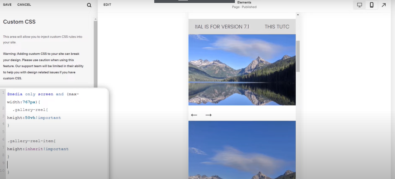
replace the values for screen (767px) and height according to your needs.
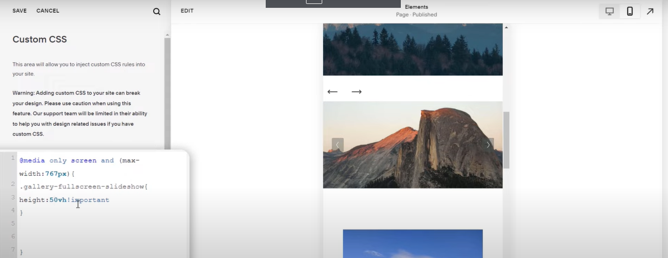
Change Full Screen
Use the following code for full screen:
@media only screen and (max-width:767px) {
.gallery-fullscreen-slideshow{
height: 30vh!important
}
}
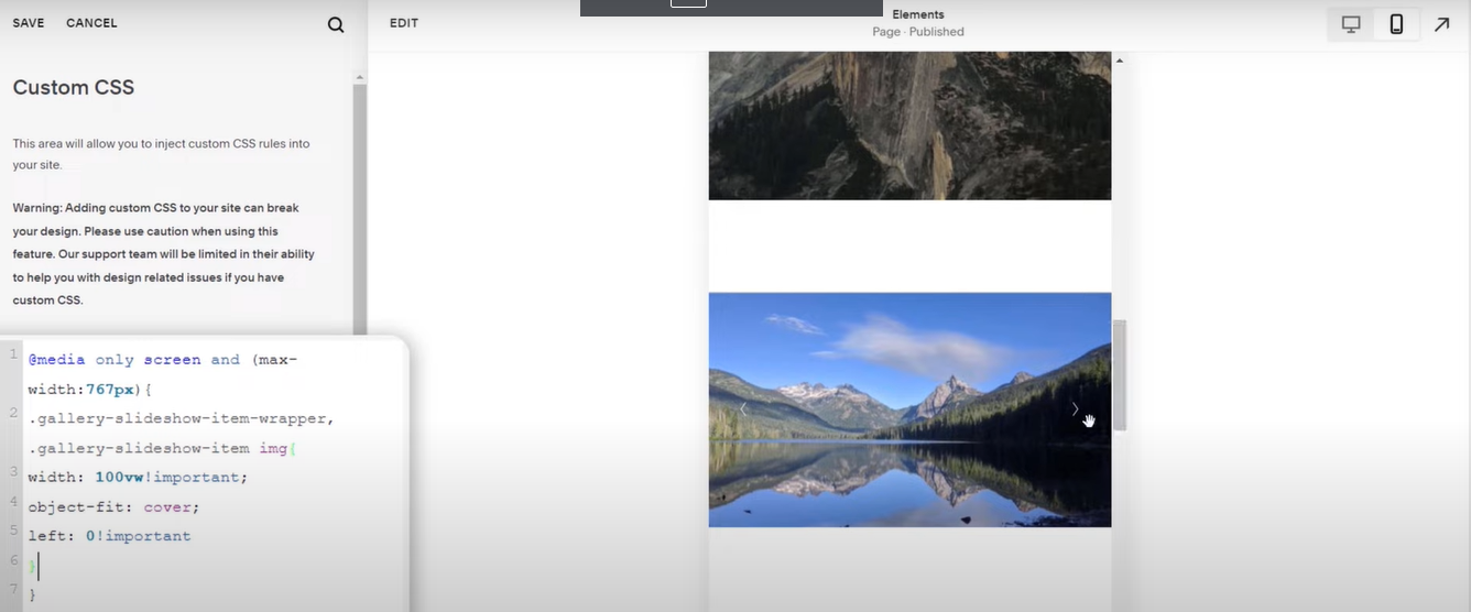
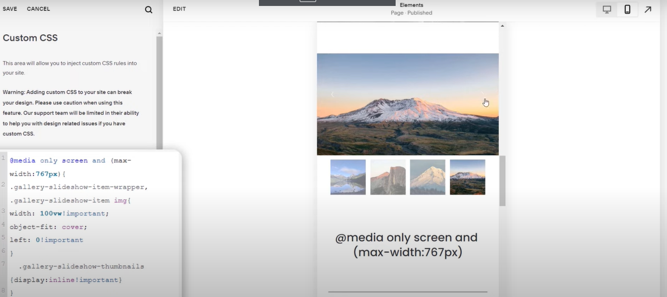
Change Slideshow
If you want to customize the slideshow on the mobile screen, use the following code:
@media only screen and (max-width:767px) {
.gallery-slideshow-item-wrapper, .gallery-slideshow-item img{
width: 100vw!important;
object-fit: cover;
left: 0!important
}
}
Slideshow Thumbnails on Mobile Screens
Slideshow thumbnails appear in desktop mode but when you switch to mobile phone mode, the thumbnails disappear. 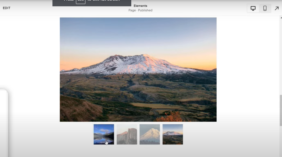
If you want to show the thumbnails on mobile screens too then copy the following code and paste it into custom CSS.
@media only screen and (max-width:767px) {
.gallery-slideshow-thumbnails {
display: inline!important
}
}
- After adding the CSS code, make sure to save your changes in the Squarespace Custom CSS editor.
- To see how your gallery section looks on mobile, you should preview your website on a mobile device or use your browser’s responsive design mode to simulate different screen sizes. Make sure the gallery appears as you intended.
- Once you are satisfied with the changes, go back to your Squarespace editor and click the “Save” button. This will publish your changes to your live website.
Remember that CSS modifications can affect the overall appearance of your website, so it’s important to test thoroughly and ensure that the changes are consistent with your site’s design. Additionally, Squarespace’s interface may evolve, so the exact steps and options might change slightly, but the general process should remain similar.
Conclusion
In conclusion, resizing the gallery section for mobile in Squarespace is a crucial step in ensuring that our website is accessible and visually engaging across all devices. This approach enhances usability and underscores our commitment to providing a well-crafted and accessible website, ultimately leaving a positive impression on our audience, regardless of the device they use to access our content.