In the fast-paced world of website design, staying ahead of the curve is crucial for engaging audiences effectively. Here comes the need to add a Mobile Information Bar in Squarespace. Squarespace, a front-runner in the web development realm, introduces a game-changing feature – the Mobile Information Bar. Tailored for business and commerce plans, this dynamic banner resides at the bottom of your site on mobile devices, providing users with quick access to vital information. In this guide, we’ll navigate through the setup process and unlock the creative potential of Squarespace’s Mobile Information Bar. Let’s start with how to add a Mobile Information Bar in Squarespace.
Steps to Add a Mobile Information Bar in Squarespace
Imagine a website feature that elegantly displays your business info when your users need it the most. The Mobile Information Bar on Squarespace does precisely that. As you scroll through your site on a mobile device, this unobtrusive yet powerful banner appears and gracefully fades away, creating an intuitive and clutter-free experience.
The Mobile Information Bar is currently available to business and commerce plans.
Enabling the Mobile Information Bar:
Let’s dive into the setup process.
- Log in to your Squarespace account.
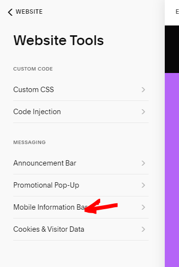
In the left sidebar of the screen, click on Website and scroll down.
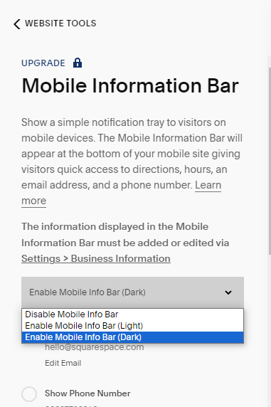
Locate “Website Tools” and you’ll find the gateway to this feature under “Mobile Information Bar.”
- Both a necessity and a design element, this bar can be enabled effortlessly. Choose between the sleek ‘Light’ or ‘Dark’ mode, aligning the aesthetics with your brand’s personality.

Populating Your Bar with Business Information:
Now, let’s infuse life into this sleek feature by populating it with your business details.
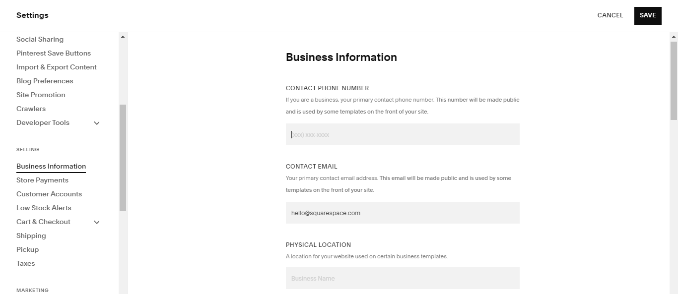
- Head over to “Business Information” under settings, and here lies the canvas for your digital storefront.
- Input your email, phone number, physical address, and business hours – the essential details that make your business tick.

Customizing the Bar to Reflect Your Brand:
The magic happens when customization meets functionality. Once your business details are in place, personalize the Mobile Information Bar by cherry-picking the elements you want to showcase. Whether it’s your email, phone number, address, or operating hours – toggle them on to create a tailored user experience.
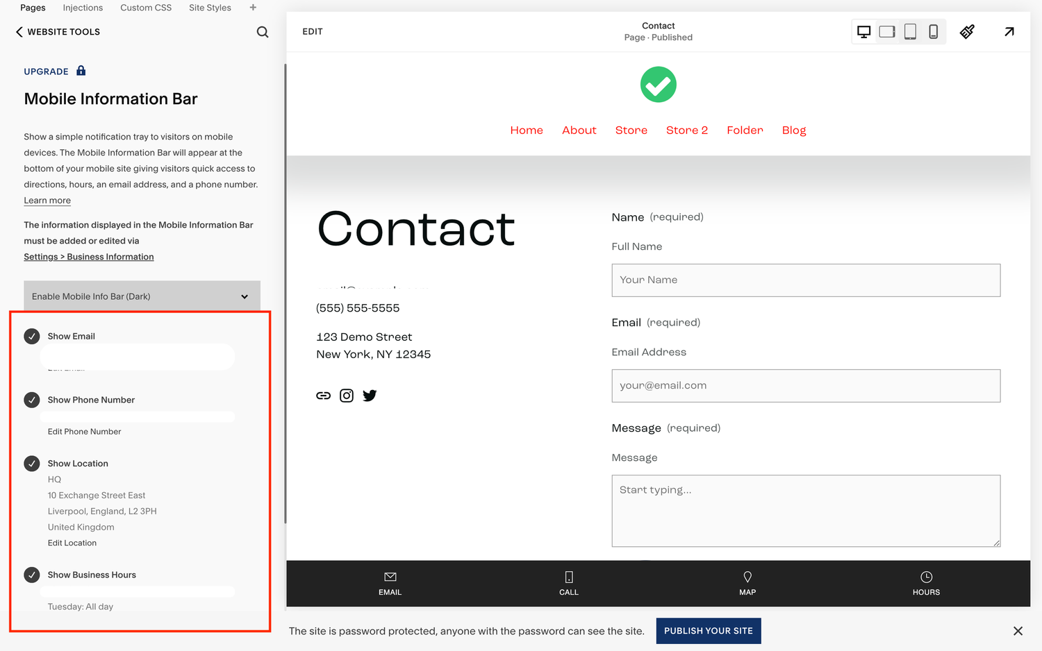
But wait, there’s more! Squarespace allows you to display up to four items, giving you the flexibility to curate the information that matters most to your audience. The result? A Mobile Information Bar that seamlessly integrates with your brand identity, delivering a cohesive and memorable user journey.
If you want to customize the Mobile info bar text, check our guide here.
Conclusion:
As we wrap up this journey into the realm of Squarespace’s Mobile Information Bar, it’s evident that this feature is more than just a practical tool – it’s a design statement. Elevate your user experience by implementing a tool that not only provides essential information but does so with finesse. Squarespace’s commitment to user-centric design shines through in this feature, giving businesses a powerful way to connect with their audience on the go. So, embark on this creative journey, enable the Mobile Information Bar, and transform your mobile user experience into a symphony of seamless design and essential information. Your audience will thank you for it.