In today’s digital age, crafting an exceptional mobile user experience is paramount for any website owner. One of the effective ways to achieve this on a Squarespace website is by mastering the art of customization. In this guide, we’ll delve into the world of Squarespace customization, with a particular focus on a crucial element: the mobile information bar. Discover how to customize the mobile info bar to make your website aesthetically pleasing and highly functional. Understanding how to customize mobile info bar text will empower you to provide a seamless and engaging mobile browsing experience for your visitors.
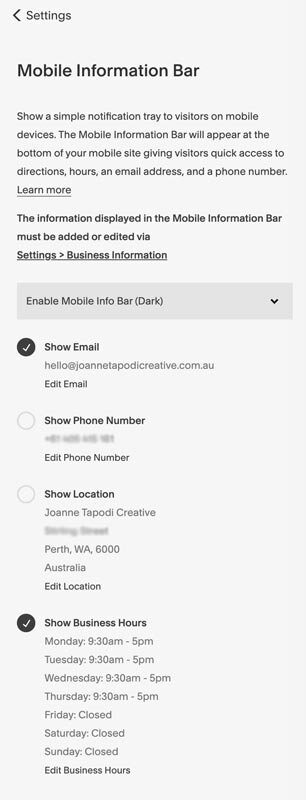
The mobile information bar is like a small banner at the bottom of your website when you’re looking at it on your phone. It shows your business info, so people can easily find your contact details when they’re on the move. It pops up when you’re at the top of a page and goes away when you scroll down.
The availability of mobile information bars is a feature exclusive to Business, Commerce, Professional, and Premium plans.
Key Elements of the Mobile Information Bar
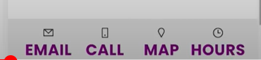
The mobile information bar can showcase various buttons, which typically include:
- Email: This button opens an email composition window with your email address pre-filled, allowing visitors to send you an email directly.
- Call: When clicked, this button triggers a call to the phone number you’ve provided, enabling users to contact your business via phone.
- Map: Clicking this button opens a map displaying a marker at your business location, making it easy for users to find your physical address.
- Hours: This button provides access to your business hours, indicating whether your business is currently open or closed to help visitors plan their visit.
It’s important to note that the mobile information bar is designed specifically for mobile devices and does not appear when viewing websites on desktop computers, tablets, or cover pages in version 7.0 of Squarespace.
How To Add a Mobile Information Bar
Let’s learn how to easily add a Mobile Information Bar to your device in a few simple steps. This bar can display important information like your email, phone number, location, and business hours for easy access.
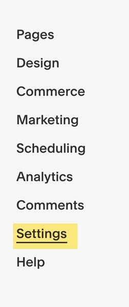
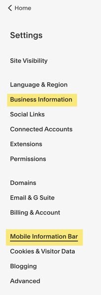
- Go to the Settings menu.

- Find the Mobile Information Bar option.

- Choose either the Dark or Light mode for the bar.
- Put in the info you want to display, like your email, phone number, location, and business hours. This info comes from your business settings.

- If you need to make changes, click the Edit button.
- Save your changes by clicking the Save button.
How To Customize Mobile Info Bar Text
Squarespace provides some built-in portions to customize mobile information bar text. when you hover over that specific section you want to customize, there is a pencil icon appearing on the corner of that section. click on that icon and customize your mobile information bar text.
This information is based on Squarespace 7.1 but is also relevant for older websites built on version 7.
As this feature is available only in premium and business plans, you’ll like to customize your site freely. Custom codes are the best way to do so. Here we’ll be using very simple codes to change the font family, font color, and font size using custom CSS. Let’s learn how to customize the text in the mobile information bar to make it more engaging.
- Log in to your Squarespace account.
- Click on the “Website” appearing in the left sidebar in editor mode.
- Scroll down to locate Website Tools and click on this option.
- You’ll find Custom CSS inside the website tools. Open Custom CSS to add custom codes.
- Copy the following codes according to your needs.
Use the following code to change the font color:
.sqs-mobile-info-bar-trigger-label {
color: purple!important
}
Use the following code to change the font size:
.sqs-mobile-info-bar-trigger-label {
font-size:1.5rem!important;
}
Use the following code to change the font-weight:
.sqs-mobile-info-bar-trigger-label
{font-weight:bold;
}
If you want to change all three then you can use the following code:
.sqs-mobile-info-bar-trigger-label {
color: purple!important;
font-size:1.5rem!important;
font-weight:bold;
}
Why didn’t we use ‘!important’ for the bold value? Well, since the source code doesn’t specify the font weight, that line of CSS isn’t conflicting with anything, so there’s no need to override it.
You can specify the font family if you have installed that on your website. You’ll just have to add the following line at the end:
font-family:poppins!important
DO NOT forget to change the color, font size and font family to match your site style.
Final Thoughts
In today’s digital world, making your website work well on mobile phones is super important. This guide is all about making your Squarespace website look and work better on mobiles, especially by improving something called the “mobile information bar.” This bar is like a small sign at the bottom of your site when you’re using your phone. It shows your important info, like how to contact you, and it’s a handy tool for people when they’re on the move. If you’re a blogger, a small business owner, or you sell things online, knowing how to tweak this bar can make your website easier and more fun to use on mobiles.