In today’s digital age, where approximately 50% of internet traffic originates from mobile devices, ensuring that your website’s mobile version is as optimized as the desktop version is paramount. Squarespace simplifies this process through its responsive design, which automatically adjusts content and images to fit various screen sizes. This article will guide you on How to customize mobile menu in Squarespace using the built-in settings, making it user-friendly for mobile users without any coding involved.
How to customize mobile menu in Squarespace
Your website’s navigation menu plays a crucial role in guiding visitors, making it essential to ensure that it’s clear, concise, and seamlessly aligns with the overall design. With the introduction of Fluid Engine, Squarespace’s new content editor, customizing your mobile site has become even more effortless, allowing you to tailor your mobile menu to perfection without needing to write a single line of code.
Customize Your Mobile Menu in Squarespace 7.1
Accessing the Mobile Menu Style Settings:
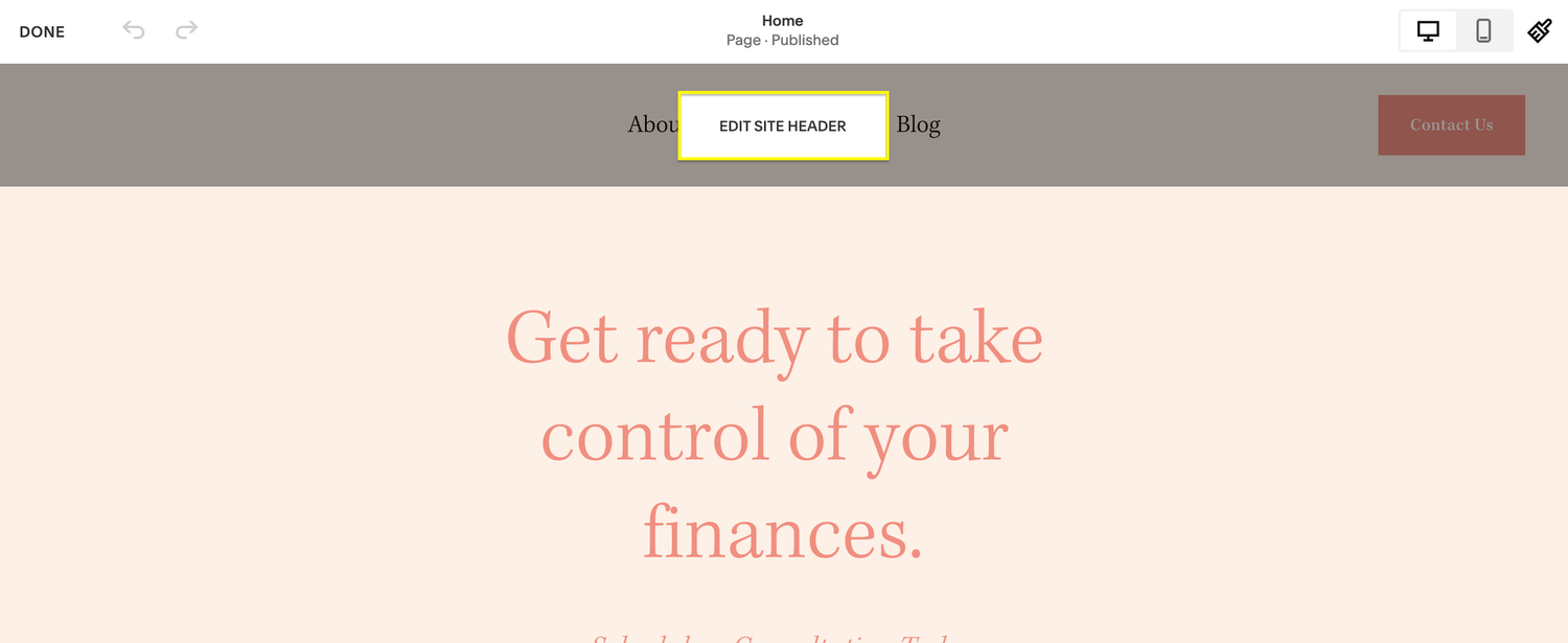
- Start by entering the Edit mode of your website.
- Hover over your website header until the “Edit Site Header” button appears, then click on it.

- A settings pop-up window will appear at the bottom right corner, displaying three icons: Global, Desktop, and Mobile settings. Click on the Mobile (phone) icon.
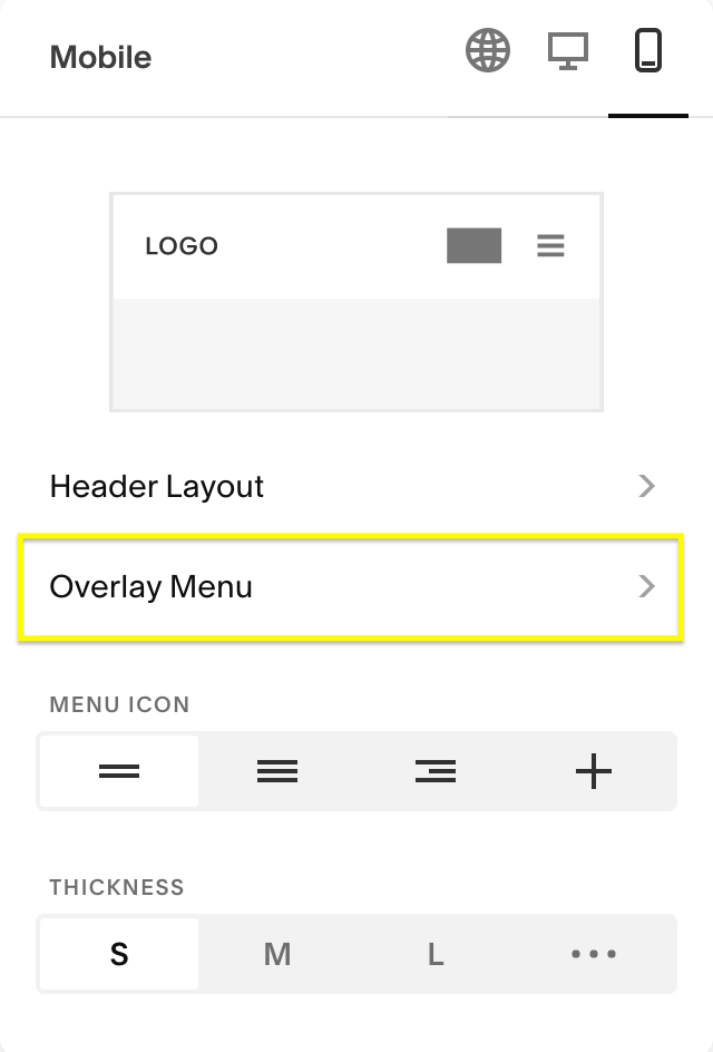
Header Layout: Squarespace offers five mobile menu header layout options. Experiment with these layouts to determine which one best complements your site’s logo or title. 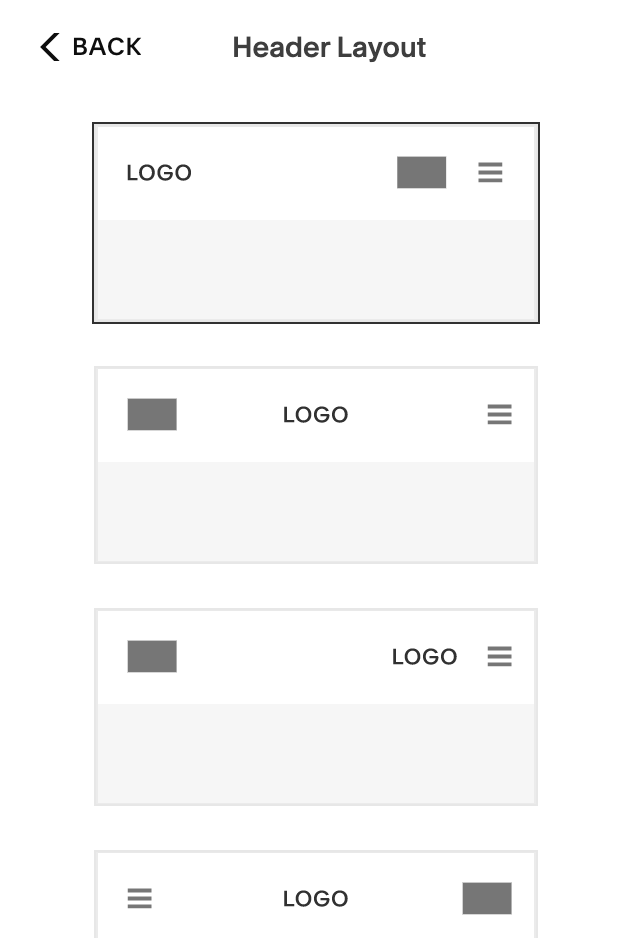
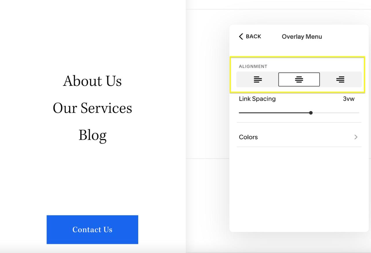
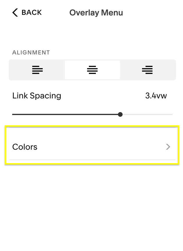
Overlay Menu: The Overlay Menu allows you to customize the appearance of the mobile menu itself. You can:
- Align the mobile menu text to the right or left (by default, it’s centered).

- Adjust the spacing between the links on your mobile menu.

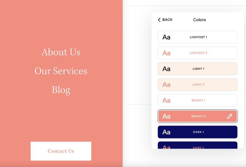
Colors: Clicking on the Colors option will direct you to a secondary menu where you can select your brand’s color palette. Explore the color options configured in Site Styles to find the one that best suits your site.
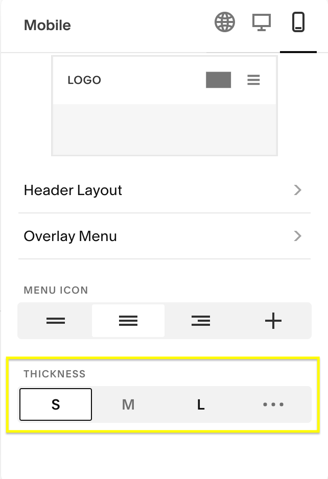
Menu Icon: Back in the main mobile menu, you’ll encounter options for customizing the Menu Icon (hamburger menu). Squarespace provides four icon styles: two lines, three equal lines, three lines aligned on the right, and a plus sign. You can also adjust the line thickness to your preference. 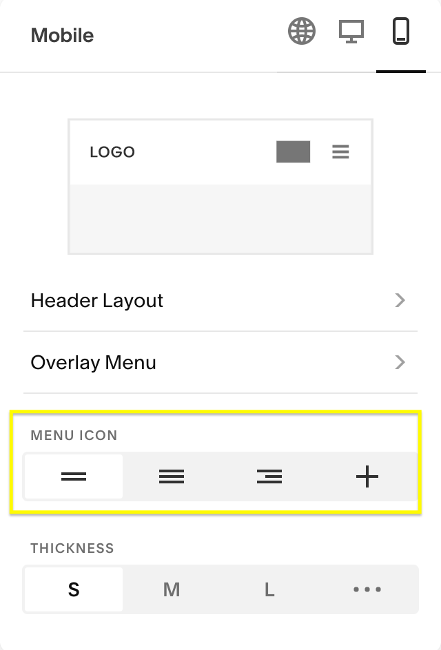
Customize Your Mobile Menu in Squarespace 7.0 (Brine Template)
Accessing the Mobile Menu Style Settings:
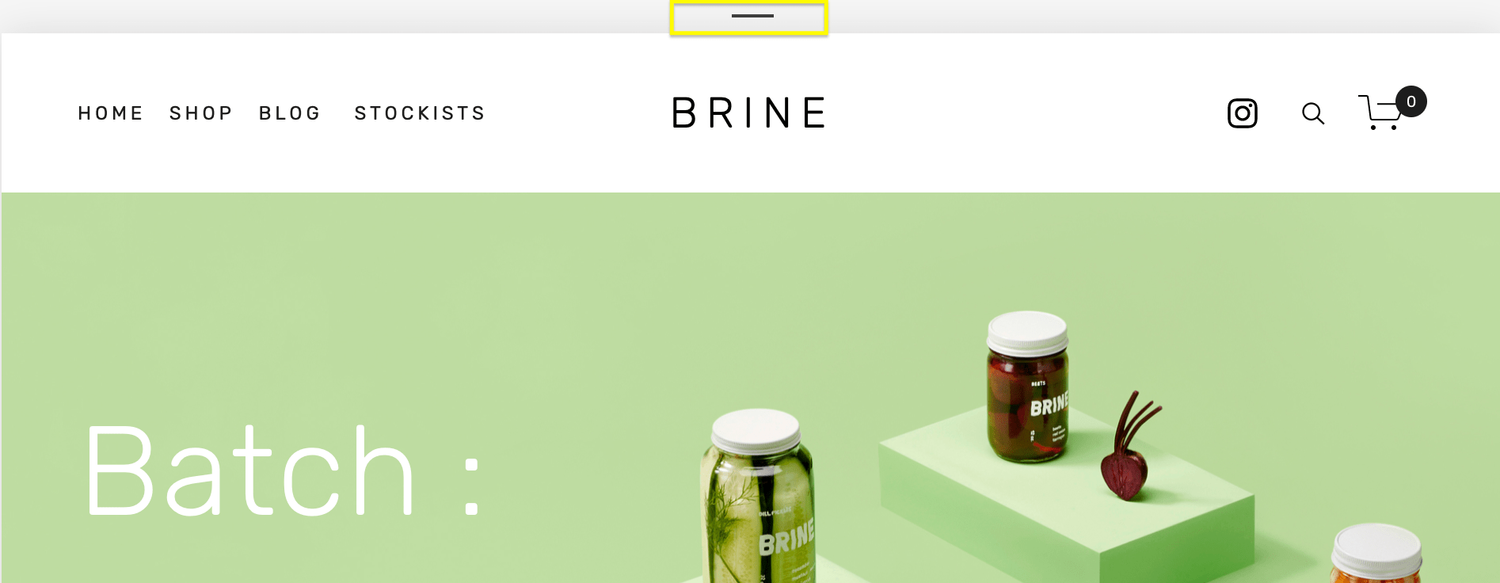
- To access the mobile version of your site, click on the horizontal line above your site window.

- Select the Mobile (phone) icon to access the mobile menu style settings.
- On the main Squarespace menu on the left side of the screen, navigate to Design > Site Styles.

- In the search bar, type “Menu” to reveal the built-in mobile menu options.
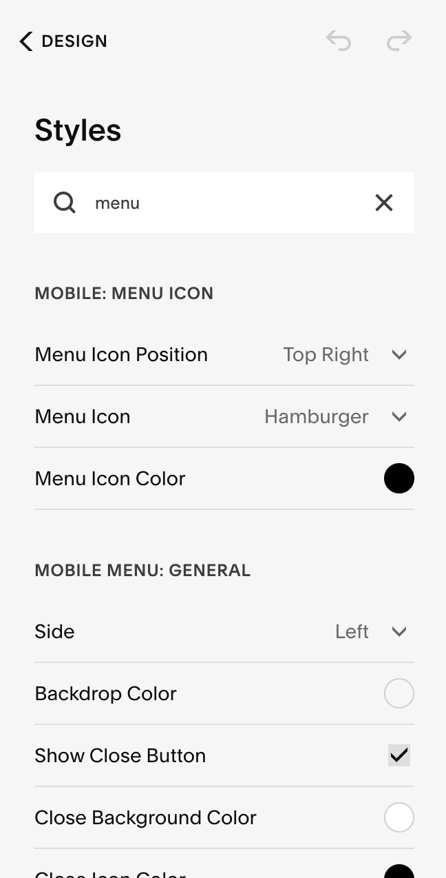
Menu Icon: Customize the mobile menu icon by scrolling down to Mobile: Menu Icon in the site style settings. You can change its position, style, and color. Choose from various styles including the classic three-line hamburger menu, plus signs, dots, or squares. 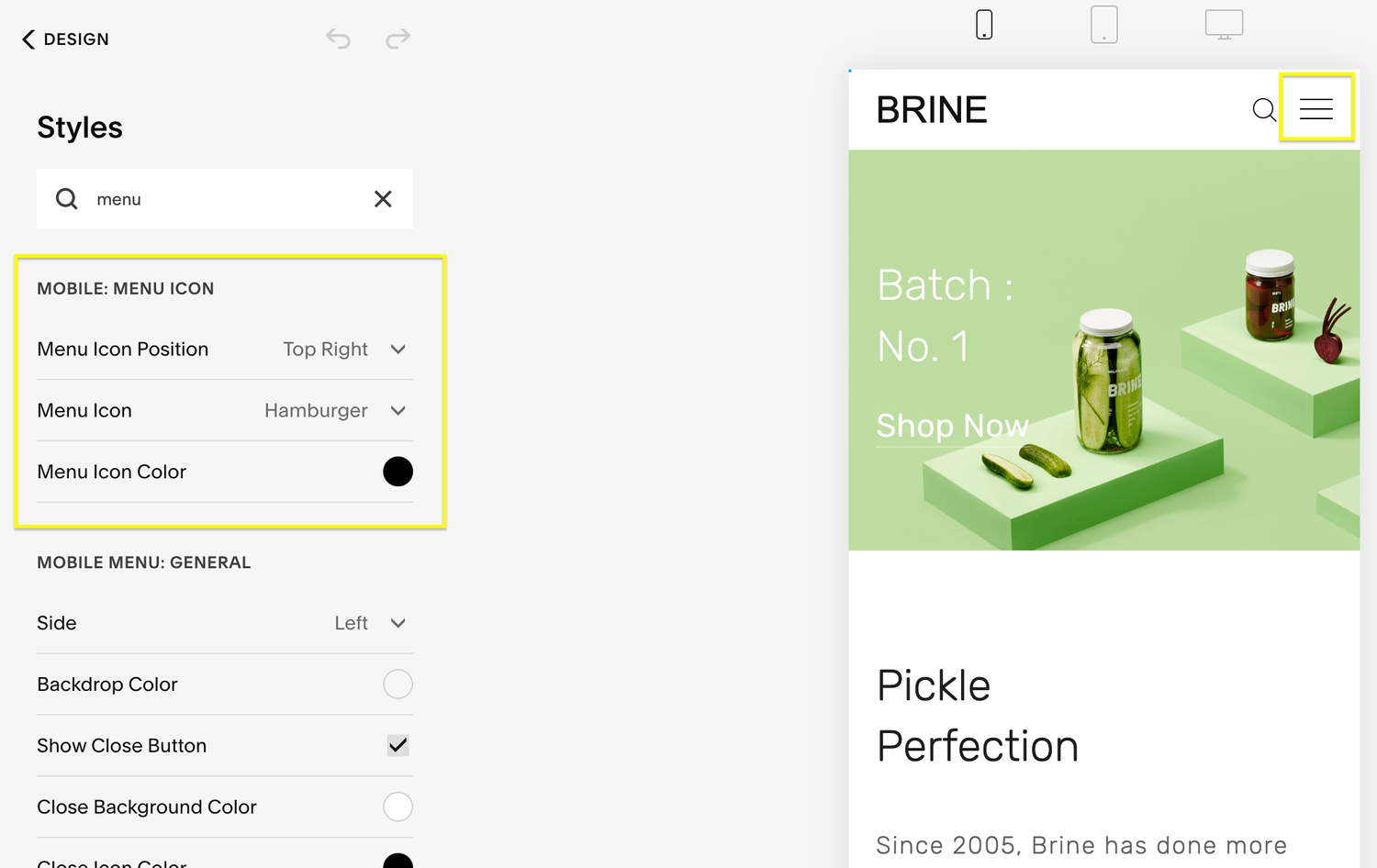
Background Color: Under Mobile Menu: General, you can modify the background color of the mobile menu, close icon, and other visible backgrounds when the mobile menu is active. You can also change the side on which the mobile menu appears. 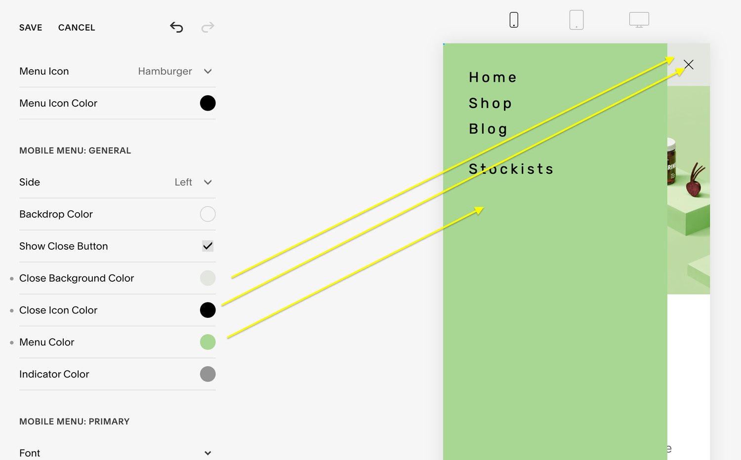
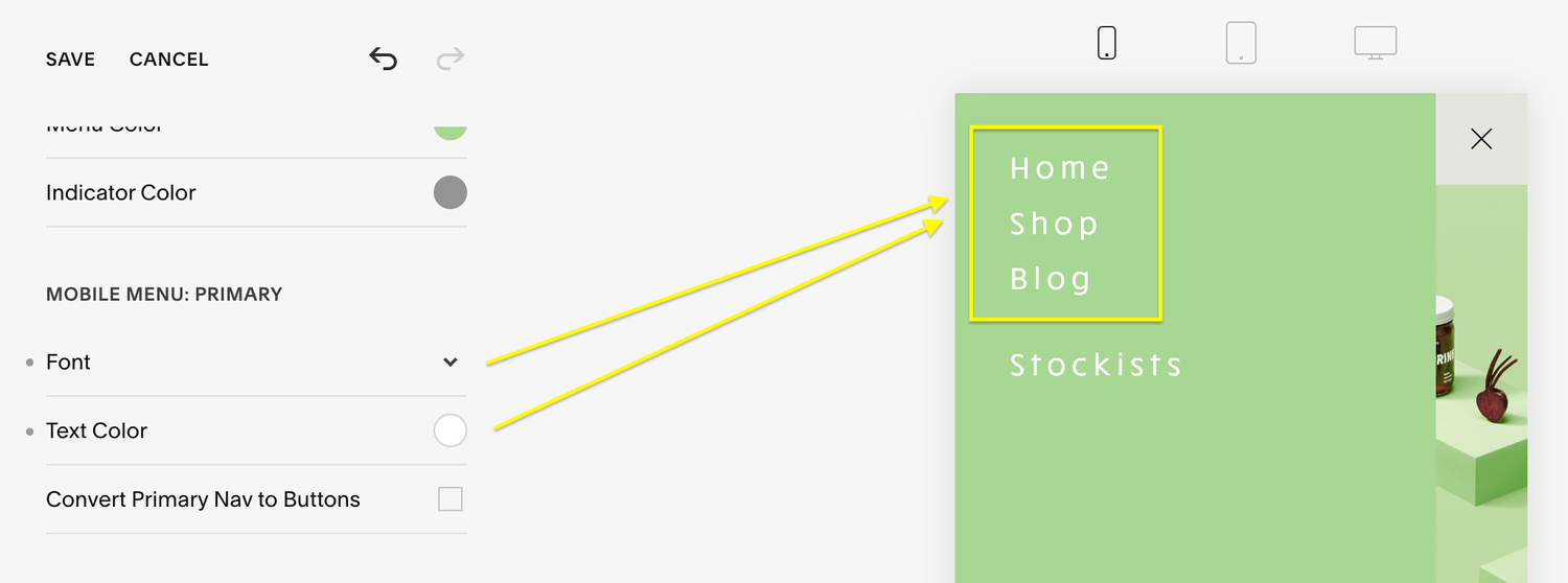
Menu Font and Color: Adjust the font style and text color under Mobile Menu: Primary and Mobile Menu: Secondary sections. You can:
- Convert navigation links to buttons.
- Customize the styling of the buttons.

To style the secondary menu, scroll down to Mobile Menu: Secondary. If you prefer the secondary menu to match the primary menu, select “Inherit Primary Nav Styles” under Mobile Menu: Secondary. Alternatively, uncheck this box to customize the secondary menu with different font styles or text colors. 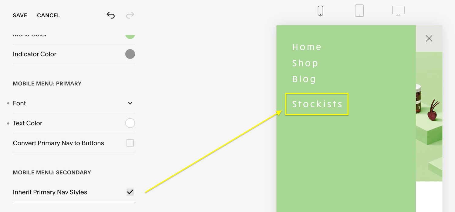
Feel free to experiment with your mobile menu’s style to create an inviting and user-friendly experience for mobile visitors. Keep in mind that these changes will only apply when viewed on a mobile device.
By following these simple steps, you can ensure that your Squarespace website is equally appealing and functional on mobile devices, making it a seamless experience for all your visitors.