Tired of your mobile website’s header disappearing like a shy ghost as visitors scroll? Longing for a trusty navigational companion that sticks around no matter how far they explore? Well, say hello to the fixed mobile header in Squarespace, your key to conquering the mobile web in Squarespace 7.1! This game-changer keeps your header proudly at the top of the screen, providing easy access to all the essentials, from menus to contact information. Ready to learn how to create a fixed mobile header in Squarespace 7.1? Let’s begin!
Need Justification for Fixed Header?
A fixed header in mobile web design is important because it:
- Ensures Consistent Navigation: Keeps essential menu and navigation options visible as users scroll, improving usability.
- Enhances User Engagement: Facilitates easy access to key features, encouraging active interaction with the content.
- Reinforces Branding: Maintains visibility of the brand logo and identity for a more memorable user experience.
- Streamlines Content Consumption: Allows quick access to menu options without interrupting content consumption, improving efficiency.
- Improves Accessibility: Enhances accessibility for users, including those with disabilities, by keeping critical features easily reachable.
- Adds Professionalism: Contributes to a polished and professional website appearance, leaving a positive impression.
How To Create A Fixed Mobile Header in Squarespace 7.1
Method 1: Using Built-in Features
Go to Headquarters: Open your Squarespace dashboard and go to “Edit > “Edit Site Header>Edit Design.” This is like finding the control center of your digital spaceship. 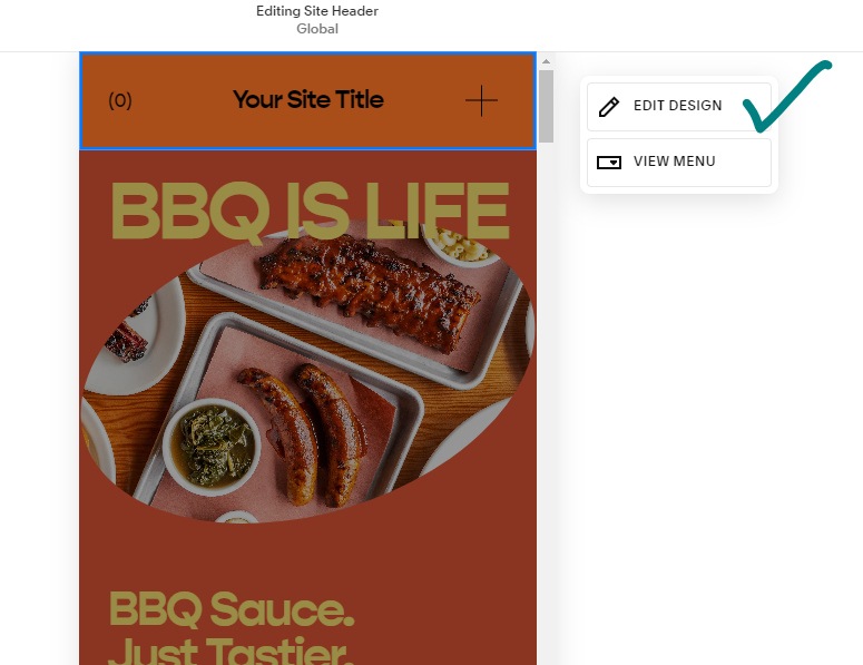
Activate the Fix Engine: Find the “Fixed Position” switch – your secret weapon. Turn it on, and voila! Your header is now attached to the top of the screen on mobile devices, always visible. 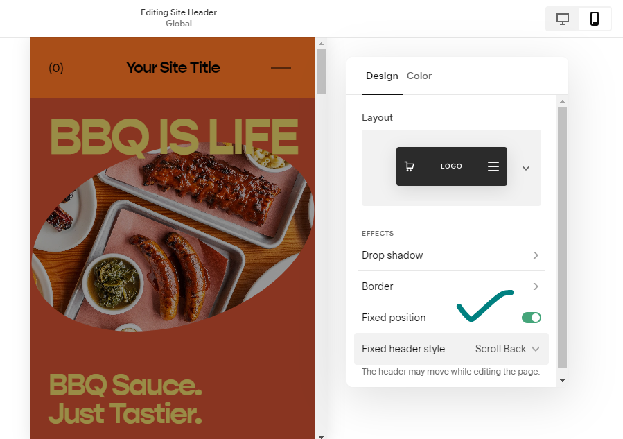
Choose Your Fix Speed: Don’t stop there! Choose between “Basic” for a constant companion or “Scroll Back” for a header that briefly hides while scrolling but quickly returns when needed. 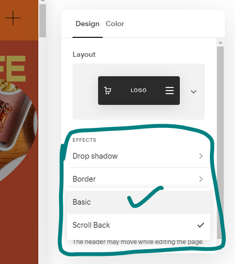
Engage Warp Drive: Click “Save,” and see the change! Your mobile users will now see a reliable header ready to guide them through your website.
Method 2: Custom Code for Adventurers
If you want more control, use Custom CSS to fine-tune your header:
Access the Code Vault: Go to “Website” in your Squarespace dashboard, scroll down to Website Tools, and click on Custom CSS.
Unleash the Magic Formula: Copy and paste this code into the “CSS” section:
@media only screen and (max-width: 768px) {
  .header {
    position: fixed;
    top: 0;
    left: 0;
    width: 100%;
    z-index: 100;
  }
}
Customize Your Ride: This code is a starting point. Feel free to tweak it! Change the background color, add padding for comfort, or adjust the font size for better visibility. Click “Save” to launch your customized header into the mobile universe.
Bonus Tips for Mobile Header Mastery:
- Test Drive Thoroughly: Check your fixed header on various mobile devices and browsers for a smooth experience for everyone.
- Keep it Lean and Mean: Avoid overloading your header with too much information. Prioritize essential navigation elements for a user-friendly experience.
- Branding Matters: Design your header to match your website’s theme for a cohesive and recognizable brand identity.
Conclusion:
Implementing a fixed mobile header not only adds a cool feature but also makes your website more user-friendly for mobile visitors. With this guide as your map, you’re now ready to turn your Squarespace site into a mobile masterpiece, one fixed header at a time! So, go ahead and conquer the mobile web, website warriors! Remember, the power to create a seamless and engaging mobile experience is in your hands.
How to Create a Scrolling Announcement Bar in Squarespace
FAQs-How To Create A Fixed Mobile Header in Squarespace 7.1
What is fixed position Squarespace?
What size is the Squarespace header?
Does Squarespace have a page limit?
What image format is best for Squarespace?
| Image attribute | Specification |
|---|---|
| File type | Only .jpg, .gif, or .png |
| File size | 20 MB limit |
| File name | Only use letters, numbers, underscores, and hyphens. |
| Image width | 2500 pixels width is ideal in most cases. |