Mobile optimization can be a headache. When things don’t fit right, images, text, and lists can turn into a mess. But don’t worry, Squarespace users! We’re conquering this challenge today. We’ll learn to create a two column list section on mobile in Squarespace. We’re conquering this challenge today. We’ll learn to create a two column list section on mobile in Squarespace.
How do we create this two-column harmony? No need for intense coding. We’ll use a trick called CSS. We’ll cover a bit of code that can tame the difficult lists. We’ll see what the lines do, personalize them, and look at other strategies for users with personal plans.
List Section in Squarespace
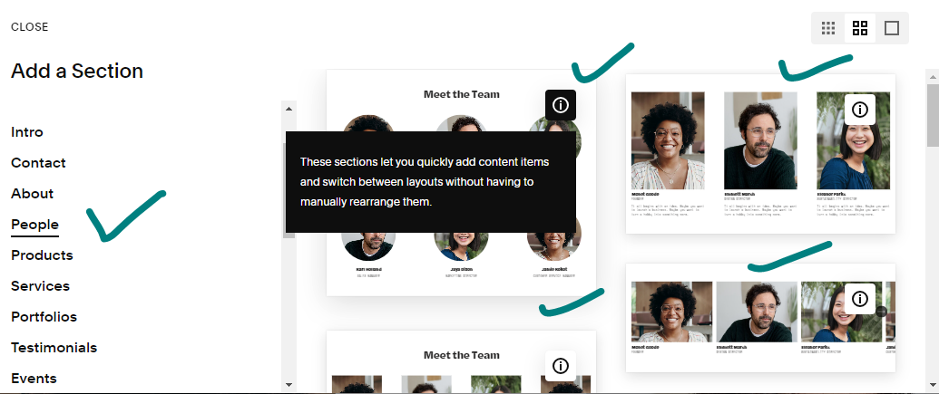
Got some info to share on your web page? Use a list section. It’s an easy tool for presenting data neatly. You can use bullet points, numbers, or icons. It’s great for showing things like features, product pluses, FAQs, team bios, or anything else that you can break down into small, digestible chunks.
How to Create A Two Column List Section on Mobile in Squarespace
Before we begin this procedure, let’s make two things clear:
- this method is particularly for Squarespace version 7.1 and it’ll NOT work for older sites built on older versions.
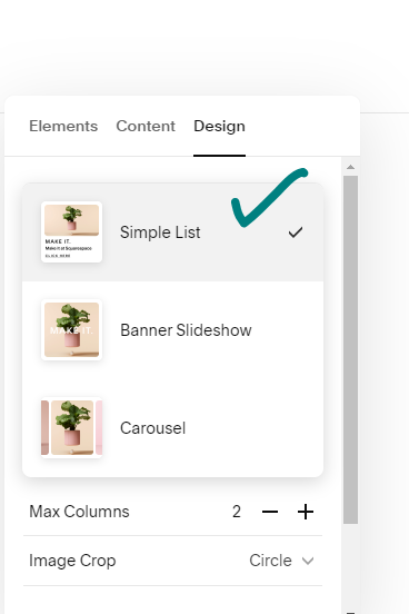
- This code will only work for Simple List NOT for Carousel or Banner.

Once you have added a list section, follow the given steps to create a two-column list section on mobile in Squarespace:
- Navigate to the Website.
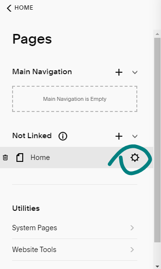
- Locate the specific page on which you have added the list section. Hover over that page.
- A gear icon will appear in front of that page, click on that icon.

- A pop-up window will appear on the screen. Click on Advanced from the left bar options.
- Copy the code given below and paste it under Page Header Code Injection.

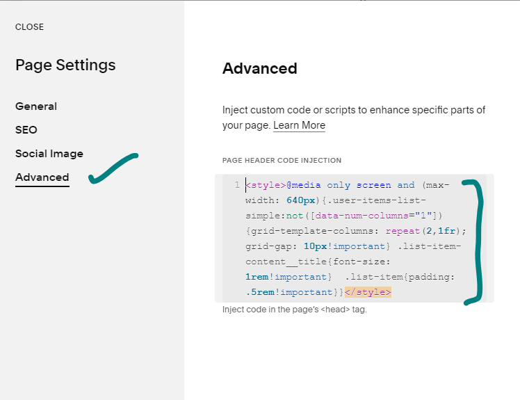
<style>@media only screen and (max-width: 640px){.user-items-list-simple:not([data-num-columns="1"]) {grid-template-columns: repeat(2,1fr); grid-gap: 10px!important} .list-item-content__title{font-size: 1rem!important} .list-item{padding: .5rem!important}}</style>
-
Adjust the code to your liking. You can change the width of the columns, the padding, the grid gap, and the font size.
-
Save the changes and preview your site on mobile. You should now see your list section with two columns of items.
Now, let’s dissect this beauty piece by piece:
1. The Targeting Spell:
@mediais the incantation that tells the code where to work its magic. It’s like saying, “Hey, listen up CSS, only apply this on screens with a maximum width of 640px.” This ensures the two-column layout kicks in only on mobile devices.
2. The List Item Transformation:
- We target
.collection-list__item, which refers to each individual item in your list. Then, we cast the following spells:width: 50%: This chops each item in half, creating two equal columns.display: inline-block: This allows the halved items to sit side-by-side instead of stacking on top of each other.padding: 10px: Adds some breathing room around the content in each column.box-sizing: border-box: Ensures the padding adds to the width of the content, not pushing it out and messing up the layout.
3. Adding Space Between Columns:
- We target
.collection-list, which refers to the entire list container. Here, we castgrid-gap: 10px, adding a 10px gap between each column for extra clarity and separation.
4. Enhancing Readability:
- Finally, we target
.collection-list__item-title, which specifies the titles within each list item.font-size: 16pxensures the titles are large enough to read comfortably on smaller screens.
Remember: This is just a starting point! You can adjust any of these values to customize the look and feel of your two-column list. Want bigger columns? Increase the width! Craving more space between them? Play with the grid-gap! Just remember to test and tweak until you achieve mobile list perfection.
Some additional tips:
- If you’re using a personal plan instead of a business or commerce subscription, you can install the code using a code block instead of the Page Header Code Injection.
- You can use this code with any type of list section, not just simple list sections.
- Be sure to play around with the code to get the look and feel that you want.
You May also like:
Image Overlay Hover Effect for Squarespace
What Version of Squarespace Do I have
How To Show A Squarespace Project Title On Mobile Devices